Setup Window Layout

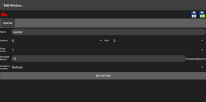
Window Layout allow user to customize the window button layout placement and its design.
The window layout user to set the grid size and the multiple page per window.
In order to access Setup Window Layout interface:
Main Menu > Setup POS > Window Layout
General Tab
| Parameter | Description | Required |
|---|---|---|
| Name | Name or the description of the object. | Yes |
| Column | The total column count of the window. | Yes |
| Row | The total row count of the window. | Yes |
| Page Count | Number of page allowed for the window layout. | Yes |
| Rounded Button | The button corner roundness. Set to 0 for squared corner, or higher number for more rounded. | Yes |
| Navigator Position | The next page and previous page button placement. This required page count more than 1. | Yes |
| Edit Button | Edit and design the window layout. | |
Window Layout Design

User able to customize the button style and its function for the Window Layout object using the Edit Button at the General Tab.
The layout grid size is based on the Column and Row setting from the General Tab.
To change the button design, user need to select one of the button that user wanted to change on the layout grid and the button will show visual styled with dash lines on the button's border, and make changes to any of the parameter on bottom half of the screen(portrait orientation) or right half of the screen(landscape orientation). After changed any of the parameter, make sure to click/tap the Apply button to apply the button design.
Click/Tap the Save(![]() ) icon button to confirm changes on the buttons and return back to Setup Window interface screen.
) icon button to confirm changes on the buttons and return back to Setup Window interface screen.
User can hold click/tap any button on the grid to show its context menu.
Below table are the parameter setting that user can be configured to the button:
| Parameter | Description | ||||||||||||||||
|---|---|---|---|---|---|---|---|---|---|---|---|---|---|---|---|---|---|
| Name | Name or the description of the button to be display. Name can be new line. | ||||||||||||||||
| Type | The type of the button function.
| ||||||||||||||||
| Object | The object of the button. The object is based on the type selection. | ||||||||||||||||
| Style | The style of the button.
| ||||||||||||||||
| Font Size | The button text size. | ||||||||||||||||
| Text Align | The text alignment or the text placement. | ||||||||||||||||
| Draw Text Box Border | Draw text box with translucent on it. The border is based on the text color. | ||||||||||||||||
| Image Scaling | Scale the image to make it fit to button size.
The scaling type can be set, below is the table list of the choice:
| ||||||||||||||||
| Design | Button design style(text color, background color, and image) can be configured here.
|